Screens and the component catalog
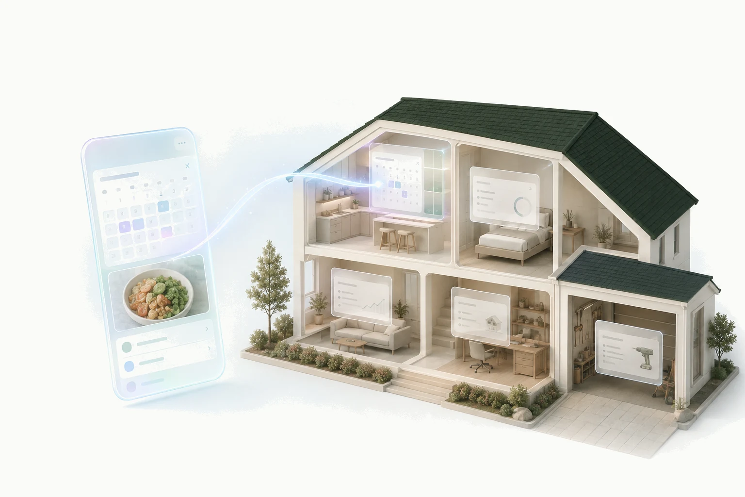
A Kaddy screen is composed from a catalog of components that Kaddy styles and keeps working on phones, in light and dark mode, and across every app. You or the builder describe what the screen should show, from which records, and what each control does; typography, spacing, touch targets and empty states are not decisions you make. This page introduces the building blocks available for that screen.
Layout and text
A screen starts with a Page, which gives it a title, an optional description and a small heading above the title, and manages width and spacing for every size of screen. Inside it, Stack arranges things in a row or a column, Grid in columns, and Card groups related content on a raised surface with its own title. Separator draws a hairline between groups.
For words there are Heading at several levels, Text in body, lead, caption, muted and code variants, Badge for a short status label, and Alert for a notice with a title and a tone such as information or warning. Tabs splits a page into named panes, Accordion and Collapsible fold sections away until they are opened, and Carousel pages through a set of items.
Showing records
Collection is the live list. Give it a table and the columns to show, and it displays the current records with a search box, turning into record cards on a phone. It has a loading state, an error state and an empty state with a message you choose, and it can be ordered by any column, newest first if you like. When anything on the screen changes a record, every Collection showing that table refreshes on its own.
RecordForm adds one record to a table. Its fields each have a label, an optional type of text, number, date or email, and whether they are required. It validates, shows that it is saving, confirms success and reports an error, and the lists refresh afterwards.
Metric shows one prominent number with a label and a note beneath it, which is where totals and streaks usually go. Progress is a bar with a value and a maximum. Table shows fixed rows you write into the screen itself; it is not connected to records, so a table of live data is always a Collection.
Named lists: a card for every record
Beyond Collection, a screen can name lists of records and lay them out however it likes. A named list reads one table, can filter it by exact values or by a range such as this month's dates, can be ordered by one column, and can be capped at a chosen number of records. Any part of the screen can then repeat once per record: a card per book with its recommendation underneath, a row per habit with a checkbox beside it.
Each named list carries its own state, so the screen can show a loading note while records arrive, a message if they could not be loaded, and an empty state when there are none. A list that is longer than its cap is reported as cut short, which matters for totals: a number computed over a partial list is withheld rather than shown wrong. The totals section explains that rule.
Named lists are read-only. A control inside a repeated card changes a record through an action, and the lists refresh; the screen never edits the list directly.
Controls
The catalog's controls are the ordinary ones: Button and Link; Checkbox, Switch and Toggle; Select, Radio, DropdownMenu, ToggleGroup and ButtonGroup for choosing among options; Slider for a number in a range; Input and Textarea for typing; Pagination for paging.
A button or link responds to a press; the choosing controls respond to a change of value. What a control does when that happens is a binding to one of the platform's actions: save, change or delete a record, run one of the app's named actions, open a conversation, or change what the screen is showing. The buttons and actions page is the complete list. A control can also ask you to confirm first, with a title, a message and, for something that cannot be undone, a red button.
A Link on a saved screen points only within your own kaddy; it cannot send you to another website. Images likewise come from the app's own files.
Dialogs, drawers and feedback
Dialog opens a panel over the page and Drawer slides one in from the edge; each has a title and a description and is opened and closed by the screen's own controls. Popover shows content next to whatever opened it, and Tooltip a short note on hover.
For waiting there are Spinner and Skeleton, a grey placeholder the shape of the content that is on its way. Avatar shows a person's picture or initials and Image a picture from the app's own files, with the alternative text a screen reader needs.
Appearance, and why you do not choose it
Kaddy owns the look: the type, the spacing, the rounded surfaces, the focus rings, and the light and dark palettes that follow your setting. Every app can wear one of Kaddy's colour skins, chosen in its Settings, and every component follows it. A saved screen cannot add its own spacing, colours or positioning. That is deliberate rather than a gap: it is what keeps a screen from covering the sidebar or the conversation beside it, and what makes a new app feel familiar the moment it appears.